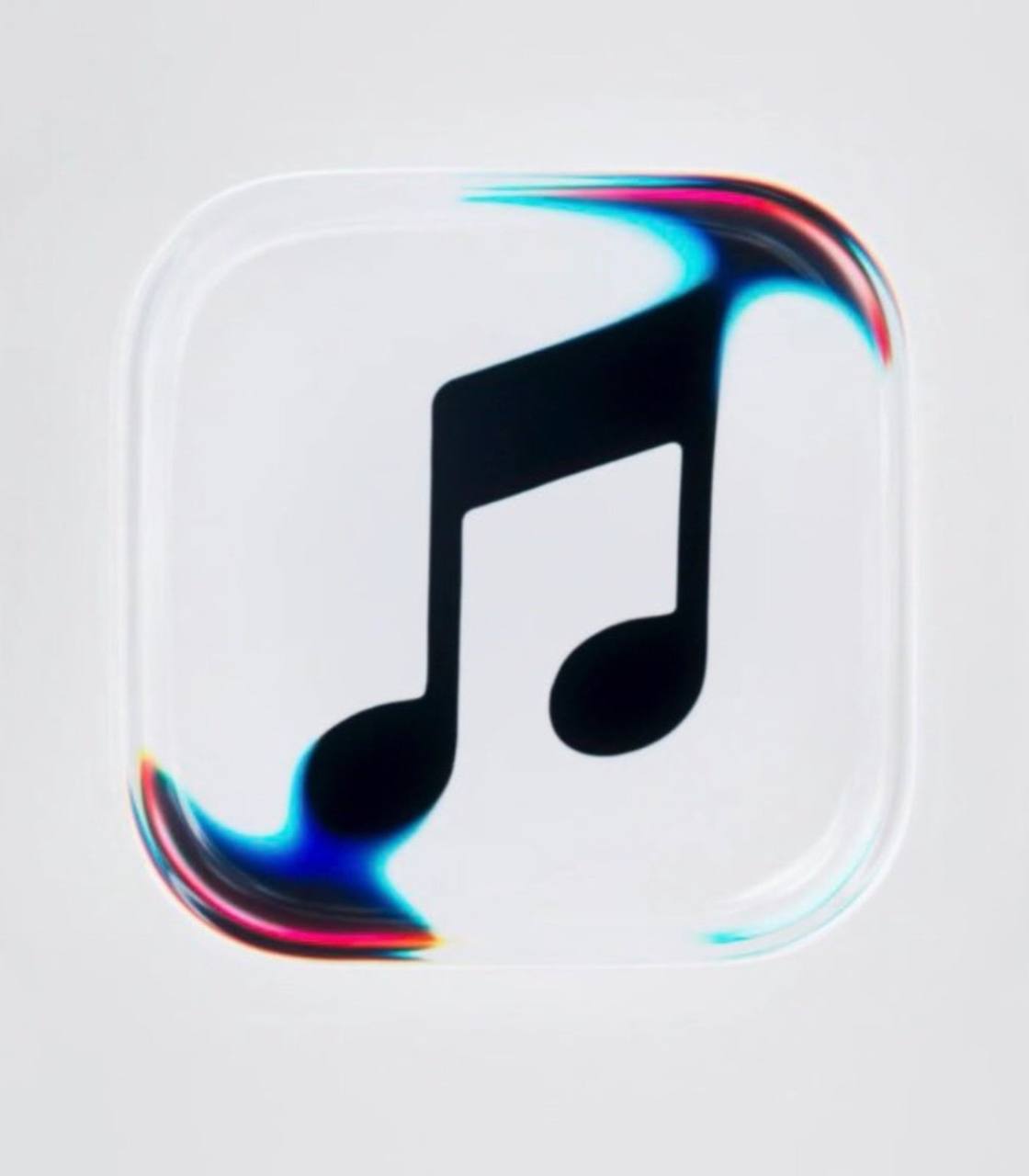
Apple Music has officially revealed a new logo and brand identity, moving away from the red branding that has defined its music streaming service for years.
The redesign, announced on October 21, 2026, introduces a black-and-white app icon, a refreshed wordmark and a new visual style inspired by the physical movement of sound. The update marks a significant change for one of Apple’s most recognisable digital services.
The new look had already begun appearing in beta versions of Apple’s upcoming software updates, sparking discussions among users about the decision to abandon the service’s familiar red-and-white appearance.
For years, Apple Music has used red and pink tones to distinguish its app from other services across Apple’s ecosystem. The new design takes a different approach, adopting a simpler monochrome appearance.
The updated app icon features a black music note against a white background in light mode, with the colours reversed in dark mode. Apple has also introduced a bolder, lowercase wordmark that gives the brand a more contemporary appearance.
The redesign extends beyond the app icon. Apple Music is updating elements of its wider visual identity, including promotional materials and the way the brand appears across its digital platforms.
One of the most interesting aspects of the rebrand is how Apple developed its new visuals. Rather than relying entirely on conventional digital design, the company explored how sound could physically shape the appearance of its branding. Working with British music producer Fred again.. and NEST Acoustics, Apple used sound-driven vibrations to create patterns and movements that informed the new visual identity.
The process involved playing sound through a setup containing liquid and capturing the resulting waves, ripples and refractions on camera. Those physical effects were then used to help develop the new visual language. The result connects the appearance of the brand directly to the service’s central purpose: music and sound.
The refreshed identity also complements Apple’s broader Liquid Glass design direction, which emphasises translucent effects, depth and fluid visual elements.
Apple has not presented the redesign simply as a change of colour. Instead, the company is positioning it as a broader creative refresh that brings together sound, movement, typography and visual design.
The new black-and-white icon also gives Apple Music a more restrained appearance, while other interface elements are receiving updates, including a shift from red and pink accents to blue in parts of the app. Whether the new identity becomes as recognisable as the previous red design will depend partly on how users respond as the changes reach more devices.
The new branding has appeared in Apple’s promotional materials and its website, while the redesigned app icon has been spotted in beta versions of iOS 27.2.
Apple’s refreshed identity is expected to roll out more widely through upcoming software releases and updates to its digital platforms. The timing may vary depending on the device and where users access Apple Music.
The change has attracted attention because the red Apple Music icon has been a familiar part of Apple’s software experience for years. Some users have criticised the monochrome design, describing it as less distinctive than the original. Others may welcome its cleaner appearance and its consistency with Apple’s evolving design language.
As with many major branding changes, the real test will be whether the new look becomes familiar once it is widely adopted.
Discover more from Scoop Hub
Subscribe to get the latest posts sent to your email.